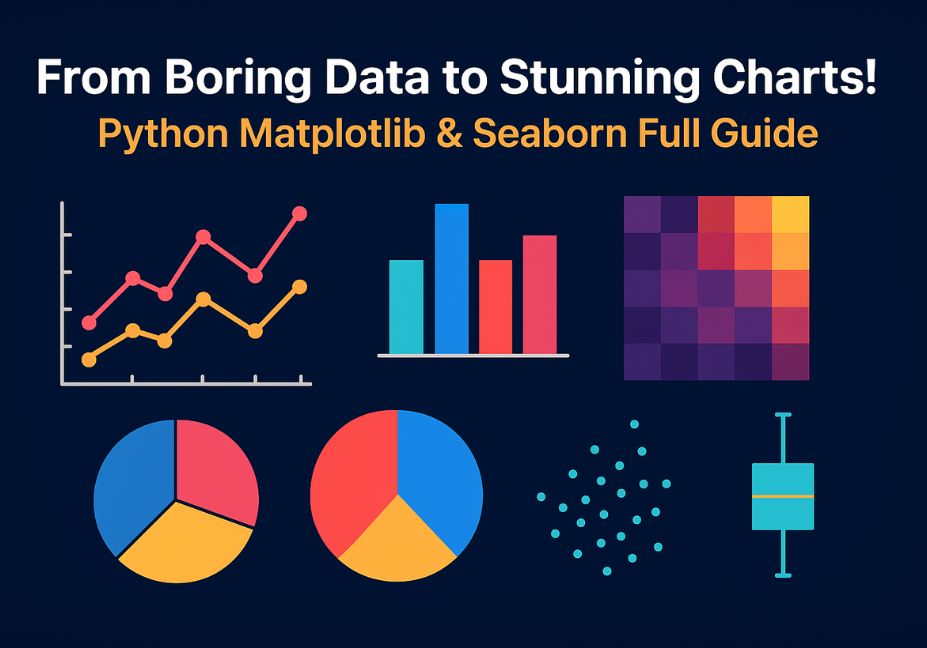
From Boring Data to Stunning Charts! Python Matplotlib & Seaborn Full Guide
Have you ever looked at a long list of numbers and thought, “What does this even mean?”
We all have! Rows and columns full of data can feel boring, confusing, and lifeless. But here’s the magic — what if you could turn those same numbers into beautiful charts and stories that your eyes and brain understand in seconds?
That’s the power of data visualization — it turns raw, messy information into clear, colorful visuals that actually speak to you.
In the world of Python data visualization, two amazing tools help us do this better than anything else — Matplotlib and Seaborn. These are the top Python libraries used by data scientists, students, and business analysts everywhere.
- Matplotlib lets you make almost any kind of chart — line graphs, bar charts, pie charts, and more. It’s like the “artist” of Python, giving you full control to design your visuals exactly how you want.
- Seaborn takes things a step further. It helps you make beautiful and statistical charts in just a few lines of code. Think of it as Matplotlib’s stylish cousin who knows design and color theory!
Together, these two libraries make your data come alive.
You can tell stories like:
- “Which month had the most sales?”
- “How do student scores compare across subjects?”
- “Which city has the highest pollution levels?”
In this Matplotlib tutorial for beginners and Seaborn full guide, you’ll learn how to take boring data and turn it into stunning charts step-by-step.
By the end, you’ll not only understand your data better — you’ll be able to show it beautifully too.
Get ready! Your journey from plain numbers to powerful visuals starts right here.
What You’ll Learn
Welcome to your Python data visualization journey!
This guide will teach you everything you need to turn plain numbers into beautiful charts that tell stories. Whether you’re a student, beginner, or future data scientist, this easy step-by-step guide will make data fun, colorful, and easy to understand.
Here’s what you’ll discover inside this Matplotlib tutorial for beginners and Seaborn full guide 👇
1. The Difference Between Matplotlib and Seaborn
You’ll learn how Matplotlib gives you full control to build every detail of a chart — colors, labels, and shapes — while Seaborn makes statistical charts automatically beautiful with modern styles and themes.
By the end, you’ll know exactly when to use Matplotlib (for custom designs) and when to use Seaborn (for fast, stylish visuals).
2. How to Visualize 15 Real-World Datasets
You’ll practice using 15 small, real-life datasets — like Monthly Sales, Student Marks, Movie Ratings, City Pollution, and more.
These are real examples you can easily understand and use for:
- Class projects 🎓
- YouTube tutorials 🎥
- Data portfolios 💼
- Business reports 📈
Each dataset will help you see how visualization turns information into insight.
3. 10+ Types of Charts You’ll Create
You won’t just learn one or two graphs — you’ll master over ten!
- 📈 Line charts (for trends over time)
- 📊 Bar charts (for category comparisons)
- 🥧 Pie charts (for proportions)
- 📦 Boxplots (for data spread and outliers)
- 🔥 Heatmaps (for correlations)
- ⚫ Scatterplots (for relationships)
- 🎨 Histograms, Violin plots, Count plots, and more!
Each chart will help you see your data in a new way.
4. Analyze Data Statistically with Visuals
You’ll also learn how to connect visuals with statistics — like how charts can show patterns, trends, correlations, skewness, and outliers.
You’ll see how visuals make it easy to explain data, even without complex math.
By the End of This Guide
You’ll master Python’s data visualization tools and create publication-ready charts for business, research, or YouTube tutorials — even if you’re a complete beginner.
Why Data Visualization Matters in Python
Have you ever opened a big Excel sheet and felt your brain say, “Nope, that’s too many numbers!” 😅
You’re not alone. Humans are built to see patterns, not read them. In fact, our brains process visuals 60,000 times faster than text. That’s why when you look at a chart, your mind instantly spots trends, highs, and lows — things that numbers alone can’t show easily.
The Psychology of Visuals
Our eyes love shapes, colors, and movement. When you turn data into a chart, you help your brain make sense of complex information instantly.
Think about it:
- A bar chart quickly shows which category wins.
- A line chart shows a story — how something rises or falls over time.
- A scatter plot shows how two things are connected.
That’s why data visualization isn’t just decoration — it’s communication.
Visuals in Data Science, Business, and Storytelling
In today’s world, Python data visualization plays a huge role everywhere:
- Data Science: Visuals help find patterns and outliers faster than raw numbers.
- Business Reporting: Managers can see growth or loss at a glance.
- Storytelling: Charts help you tell stories backed by real data — like how sales grew month by month or how student marks improved.
A sales spreadsheet is boring.
But a line chart? It tells a story of progress, peaks, and success.
That’s the difference between numbers and insight.
Matplotlib and Seaborn Make It Effortless
Python gives us two amazing tools to do this magic — Matplotlib and Seaborn.
- Matplotlib helps you build charts from scratch, giving you full control over every color, line, and label.
- Seaborn takes care of design and statistics for you — making statistical storytelling effortless.
Together, they turn plain data into something beautiful, smart, and easy to understand — whether you’re presenting in a classroom, boardroom, or YouTube tutorial.
Setting Up Your Python Visualization Environment
Before we start making beautiful charts, let’s make sure your computer is ready for it.
You only need a few tools to begin your Python data visualization journey. Think of them as your artist’s brushes and paints! 🎨
⚙️ Step 1: Install the Required Libraries
Open your command prompt or terminal and type this simple line:
pip install matplotlib seaborn pandas numpyThat’s it! ✅
Here’s what you just installed:
| Library | Purpose |
|---|---|
| Matplotlib | The main library for creating charts and plots from scratch. Perfect for beginners who want to learn the basics. |
| Seaborn | Builds on top of Matplotlib and makes your charts more beautiful, colorful, and statistical. |
| Pandas | Helps you work with data easily using rows and columns (just like Excel, but smarter!). |
| NumPy | Handles numbers and calculations fast — it’s used by Pandas, Matplotlib, and Seaborn behind the scenes. |
These are the four friends you’ll use again and again in every data project. 🧩
💻 Step 2: Import the Libraries
Once you’ve installed them, open Jupyter Notebook, VS Code, or any Python IDE and type:
import matplotlib.pyplot as plt
import seaborn as sns
import pandas as pd
import numpy as np
This tells Python, “Hey, I want to use these libraries!”
You’ll use these short names — plt, sns, pd, and np — in almost every chart you make.
Why This Setup Matters
When you install Matplotlib and install Seaborn, you unlock the full power of Python data visualization.
They’ll let you:
- Create colorful line, bar, pie, and box charts
- Analyze your data visually
- Share insights quickly
Now that your tools are ready, let’s bring in the data that we’ll visualize next!
Understanding Your Dataset
Now that your setup is done, it’s time to meet your data — the heart of visualization.
To make learning fun and real, we’ll use 15 small, easy-to-understand datasets. Each one represents a real-world scenario from business, education, health, technology, or the environment.
1. Sales
| Month | Sales |
|---|---|
| Jan | 775 |
| Feb | 328 |
| Mar | 710 |
| Apr | 723 |
| May | 686 |
📈 We’ll use this to make line and bar charts showing sales trends over time.
2. Education
| Student | Math | Science | English |
|---|---|---|---|
| Ali | 78 | 83 | 69 |
| Sara | 90 | 85 | 88 |
| Hamza | 67 | 74 | 72 |
| Hina | 80 | 90 | 84 |
| Usman | 58 | 64 | 70 |
📚 Used to compare subject performance with bar and box plots.
3. Business
| Category | Sales | Profit |
|---|---|---|
| Electronics | 12500 | 2200 |
| Clothing | 8500 | 1800 |
| Grocery | 9600 | 1600 |
| Books | 4300 | 900 |
| Toys | 7100 | 1500 |
Perfect for comparing product categories with bar and pie charts.
4. Health
| Age | Blood_Pressure | Heart_Rate |
|---|---|---|
| 25 | 110 | 72 |
| 32 | 125 | 78 |
| 45 | 138 | 85 |
| 54 | 142 | 90 |
| 63 | 150 | 95 |
Use this to draw scatter plots and heatmaps to find health patterns.
5. Tech
| Car_Model | Mileage | Engine_Size | Price |
|---|---|---|---|
| A | 18 | 1.2 | 18000 |
| B | 15 | 1.5 | 22000 |
| C | 22 | 1.1 | 17000 |
| D | 12 | 2.0 | 28000 |
| E | 25 | 1.0 | 16000 |
Visualize relationships between engine size, mileage, and price using scatter plots.
6. Environment
| City | PM2.5 | AQI | Temperature |
|---|---|---|---|
| Lahore | 180 | 320 | 25 |
| Karachi | 120 | 220 | 30 |
| Islamabad | 90 | 180 | 26 |
| Faisalabad | 150 | 270 | 28 |
| Multan | 130 | 240 | 31 |
Use this dataset to build heatmaps and line plots that show air quality differences. You can use also one of the following data.
7. Website Traffic
| Day | Visitors |
|---|---|
| 1 | 310 |
| 2 | 420 |
| 3 | 380 |
| 4 | 600 |
| 5 | 750 |
| 6 | 900 |
| 7 | 820 |
8. Department Salaries
| Department | Average_Salary |
|---|---|
| HR | 68000 |
| Finance | 72000 |
| IT | 95000 |
| Sales | 78000 |
| Admin | 65000 |
9. Employee Performance
| Employee | Projects_Completed | Efficiency_Score |
|---|---|---|
| E1 | 5 | 78 |
| E2 | 7 | 85 |
| E3 | 3 | 72 |
| E4 | 9 | 90 |
| E5 | 4 | 80 |
10. Car Fuel Efficiency
| Car_Model | Mileage (km/L) | Engine_Size (L) | Price ($) |
|---|---|---|---|
| A | 18 | 1.2 | 18000 |
| B | 15 | 1.5 | 22000 |
| C | 22 | 1.1 | 17000 |
| D | 12 | 2.0 | 28000 |
| E | 25 | 1.0 | 16000 |
11. E-commerce Orders
| Day | Orders | Revenue ($) |
|---|---|---|
| 1 | 180 | 5600 |
| 2 | 240 | 7300 |
| 3 | 200 | 6800 |
| 4 | 310 | 8200 |
| 5 | 280 | 7900 |
| 6 | 350 | 8800 |
| 7 | 390 | 9500 |
12. Exam Scores Comparison
| Class | Average_Score | Pass_Rate (%) |
|---|---|---|
| A | 85 | 98 |
| B | 78 | 94 |
| C | 82 | 97 |
| D | 75 | 90 |
| E | 88 | 99 |
13. Customer Satisfaction
| Store | Rating (1-5) | Waiting_Time (min) |
|---|---|---|
| A | 4.5 | 6 |
| B | 3.8 | 10 |
| C | 4.9 | 4 |
| D | 4.1 | 8 |
| E | 3.5 | 12 |
14. Movie Ratings
| Genre | Rating | Votes |
|---|---|---|
| Action | 7.8 | 25000 |
| Drama | 8.2 | 32000 |
| Comedy | 7.1 | 15000 |
| Romance | 6.8 | 12000 |
| Sci-Fi | 8.5 | 28000 |
15. Hospital Patient Data
| Age | Blood_Pressure | Heart_Rate |
|---|---|---|
| 25 | 110 | 72 |
| 32 | 125 | 78 |
| 45 | 138 | 85 |
| 54 | 142 | 90 |
| 63 | 150 | 95 |
| 70 | 160 | 88 |
16. Mobile Brand Sales
| Brand | Units_Sold | Market_Share (%) |
|---|---|---|
| Apple | 25000 | 35 |
| Samsung | 22000 | 30 |
| Vivo | 12000 | 15 |
| Oppo | 8000 | 10 |
| Xiaomi | 6000 | 10 |
17. City Pollution Levels
| City | PM2.5 | AQI | Temperature (°C) |
|---|---|---|---|
| Lahore | 180 | 320 | 25 |
| Karachi | 120 | 220 | 30 |
| Islamabad | 90 | 180 | 26 |
| Faisalabad | 150 | 270 | 28 |
| Multan | 130 | 240 | 31 |
Download whole Jupyter Code.
Matplotlib — The Foundation of Python Visualization
When it comes to Python data visualization, Matplotlib is where it all begins. Think of it as the “mother” of all chart libraries in Python — even Seaborn is built on top of it!
Matplotlib gives you complete control over your charts — colors, fonts, grid lines, and everything in between. It’s flexible, powerful, and perfect for anyone who wants to create custom visuals from scratch.
Let’s explore what makes Matplotlib so special. 👇
What is Matplotlib?
Matplotlib is a Python library used to create 2D charts and plots from your data. It helps turn simple lists or tables of numbers into easy-to-understand visuals.
With it, you can make all types of charts — from line plots and bar charts to histograms, pie charts, and scatterplots.
Why it matters:
- You can see trends, not just read numbers.
- It’s perfect for business, education, and research.
- You can customize everything, making your visuals ready for reports or presentations.
💡Tip:
If you’re searching for matplotlib python examples, you’ll find that this library is the foundation of almost every visualization project in Python.
Basic Syntax
Here’s the simplest way to make your first chart:
import matplotlib.pyplot as plt

x = ['Jan', 'Feb', 'Mar', 'Apr']
y = [775, 328, 710, 723]

plt.plot(x, y)
plt.show()
That’s it! You just created your first line chart with only two lines of code.
Core Chart Types
Here are some of the most common Matplotlib chart types you’ll use — along with the best dataset and function for each:
| Chart Type | Dataset Example | Function |
|---|---|---|
| 📈 Line Chart | Monthly Sales | plt.plot() |
| 📊 Bar Chart | Product Sales | plt.bar() |
| 📉 Histogram | Student Marks | plt.hist() |
| 🥧 Pie Chart | Mobile Brand Sales | plt.pie() |
| 📦 Boxplot | Customer Ratings | plt.boxplot() |
Each of these charts helps tell a different kind of story:
- Line charts show trends over time.
- Bar charts compare categories.
- Histograms show distribution of values.
- Pie charts show proportions.
- Boxplots show spread and outliers.
Advanced Customization
Matplotlib gives you the power to style your visuals just the way you like.
Here are a few must-know tricks for beautiful visuals:
plt.style.use('seaborn')            # Apply modern style
plt.figure(figsize=(10,5))          # Set chart size
plt.title('Monthly Sales Trend')    # Add a title
plt.xlabel('Month')                 # Label X-axis
plt.ylabel('Sales')                 # Label Y-axis
plt.grid(True)                      # Add grid lines
plt.legend(['Sales Data'])          # Add legend
You can even change colors, fonts, background styles, and annotations to make your charts ready for business reports or YouTube tutorials.
Matplotlib is your complete python plotting guide — powerful, flexible, and essential for any data analyst.
Seaborn — The Statistical Visualization Powerhouse
Now, let’s make things prettier and easier with Seaborn — Matplotlib’s colorful and stylish cousin! 😍
Why Use Seaborn?
While Matplotlib gives you control, Seaborn gives you style and simplicity.
Seaborn automatically adds:
- Soft colors 🎨
- Clean themes 🎯
- Built-in statistical tools 📊
You can create complex charts with just one line of code.
Popular Seaborn Functions
| Chart Type | Function | Example Dataset |
|---|---|---|
| 📈 Line Plot | sns.lineplot() | Temperature Over Months |
| 📊 Bar Plot | sns.barplot() | Department Salaries |
| 📦 Boxplot | sns.boxplot() | Customer Ratings |
| ⚫ Scatterplot | sns.scatterplot() | Car Efficiency |
| 🔥 Heatmap | sns.heatmap() | Hospital Data |
| 🧩 Pairplot | sns.pairplot() | Multi-column Data |
Each of these Seaborn charts is designed to show statistical patterns instantly — without needing manual calculations.
Seaborn Styling
You can set the overall look of your charts easily:
sns.set_theme(style="whitegrid", palette="coolwarm")Then, you can add extra beauty with hue (color by category) and size (bubble size).
Example:
sns.scatterplot(x='Mileage', y='Price', hue='Car_Model', size='Engine_Size', data=df)This one line gives you an interactive-looking, multi-dimensional chart that’s both informative and stunning.
Statistical Insight Through Visualization
Charts do more than just look nice — they explain your data.
With Matplotlib and Seaborn, you don’t just create visuals; you uncover statistical insights that numbers alone can’t show.
Let’s explore how these tools help you see statistics in action 👇
1. Distributions → Histograms & KDE Plots
Want to know how your data is spread out?
Use histograms and KDE (Kernel Density Estimate) plots.
- Matplotlib:
plt.hist(df['Sales'])shows how often certain values appear. - Seaborn:
sns.histplot(df['Sales'], kde=True)gives you a smooth, colorful curve that shows the distribution shape.
Example:
If your sales data has one tall peak, it means most values are close to each other. If it’s stretched to one side, that means skewness — your data leans left or right.
Skewness tells us how lopsided the data is, and
Kurtosis tells us how tall or flat the curve is.
Together, they describe whether your data follows a normal distribution (bell shape) or not — something you can see instantly with a Seaborn chart!
2. Correlations → Scatter & Heatmaps
When you want to see how two things relate, use scatter plots and heatmaps.
- Scatter Plot:
sns.scatterplot(x='Mileage', y='Price', data=cars)
👉 Shows relationships between two continuous variables.
Example: as car mileage increases, price might drop. - Heatmap:
sns.heatmap(df.corr(), annot=True, cmap='coolwarm')
👉 Instantly shows how multiple variables are connected.
Example:
In the City Pollution dataset, a heatmap can reveal that AQI and PM2.5 move together, meaning when one rises, so does the other. That’s correlation made visual!
3. Comparisons → Bar & Boxplots
Sometimes you want to compare groups or categories — like which department earns more or which store has happier customers.
- Bar Chart:
sns.barplot(x='Department', y='Average_Salary', data=df)
Quickly compares categories side-by-side. - Boxplot:
sns.boxplot(x='Store', y='Rating', data=df)
Shows the range, median, and outliers of each group.
Example:
A boxplot of store ratings reveals which stores have consistent satisfaction and which ones have extreme ups or downs.
4. Trends → Line Charts
When your data involves time or sequence, line charts are perfect.
- Matplotlib:
plt.plot(months, sales) - Seaborn:
sns.lineplot(x='Month', y='Sales', data=df)
Example:
From the Monthly Sales dataset, a line chart shows how sales rise and fall through the year — instantly showing the business trend.
5. Statistical Distributions — Normal, Binomial, Poisson
Matplotlib and Seaborn can also visualize probability distributions — a big part of statistics.
- Normal Distribution: Bell-shaped, common in height or test scores.
- Binomial Distribution: Success/failure (like coin toss outcomes).
- Poisson Distribution: Number of events (like customers arriving per hour).
Example insight:
When you visualize these using Matplotlib, you can see probability in action — which helps explain real-world behavior like sales frequency or website traffic.
In short:
- Use histograms to see spreads.
- Use scatter and heatmaps to see relationships.
- Use bar and boxplots to compare groups.
- Use line charts to track change over time.
That’s how Python data visualization with Matplotlib and Seaborn turns statistics into something visual, clear, and easy to explain — even for beginners!
Matplotlib vs Seaborn — Key Differences
Both Matplotlib and Seaborn help you make amazing charts, but they shine in different ways.
Let’s compare them side by side 👇
| Feature | Matplotlib | Seaborn |
|---|---|---|
| Level | Low (manual) | High (automatic) |
| Focus | Customization | Statistical insight |
| Look | Simple | Beautiful by default |
| Best For | Publication visuals | Quick analysis |
| Ease of Use | More code | Fewer lines of code |
| Flexibility | Maximum control | Limited but elegant |
| Integration | Works with Pandas, NumPy | Built on top of Matplotlib |
In simple words:
- Matplotlib is like painting with a brush — you control every stroke.
- Seaborn is like using a filter — it instantly makes everything look good.
If you ever wonder which to use, remember this internal anchor:
👉 matplotlib vs seaborn python — use Matplotlib for detailed design and Seaborn for quick, beautiful insights.
Pro Tips for Stunning Charts
You’ve learned how to make charts — now let’s make them look amazing! 🌈
Even a simple graph can turn into a stunning, professional visual with a few smart design tricks.
Here are some easy but powerful pro tips to make your charts stand out:
1. Use Consistent Colors and Fonts
Keep your colors and fonts the same across all charts.
It makes your visuals look clean, professional, and easy on the eyes.
Example:
If your “Sales” bar is blue in one chart, keep it blue everywhere — it helps people follow your story without confusion.
2. Always Label Axes and Add a Title
A chart without labels is like a story without characters.
Use:
plt.title("Monthly Sales Trend")
plt.xlabel("Month")
plt.ylabel("Sales")
This helps your readers instantly understand what they’re looking at.
3. Use plt.figure(figsize=(10,6)) for Readable Visuals
Big charts are easier to read and look better in reports and blogs.
A 10×6 size works perfectly for most visualizations.
4. Use Beautiful Color Palettes
Seaborn and Matplotlib offer built-in color palettes that look stunning:
"coolwarm"– great for heatmaps and comparisons"Set2"– soft colors perfect for categories"viridis"– visually balanced and color-blind friendly
Example:
sns.set_palette("coolwarm")Your visuals will instantly look more modern and professional.
5. Don’t Overload One Chart
Keep your visuals clean and meaningful.
Too many lines, colors, or categories can confuse the viewer.
It’s better to make two simple charts than one messy one.
Remember — clarity beats complexity.
Common Mistakes to Avoid
Even pros make small mistakes that can ruin a great visualization.
Here’s what to avoid when creating your Python data visualization masterpieces 👇
1. Using Text Columns in Correlation Heatmaps
Correlation only works with numbers.
If your column has words (like “Jan”, “Feb”, “Mar”), Python will show this error:
could not convert string to float
✅ Fix: Use only numeric columns or convert text to numbers before plotting.
2. Forgetting to Call plt.show()
Without it, your chart might not appear at all!
Always end your Matplotlib plots with:
plt.show()3. Overlapping Labels
If labels overlap, use:
plt.xticks(rotation=45)
plt.tight_layout()
It makes your chart look tidy and readable.
4. Ignoring Data Scaling Before Plotting
If your numbers are too large or small, they might make your chart hard to read.
Normalize or scale them so all data fits well on the screen.
5. Using Too Many Colors
Color should guide the viewer — not distract them.
Stick to 3–5 colors for most charts.
Too many colors make your chart noisy and confusing.
Real-World Applications of Data Visualization
Data visualization isn’t just for practice — it’s used everywhere
From business decisions to medical research, visuals help people make sense of data faster and smarter.
Here’s how different industries use Matplotlib and Seaborn every single day 👇
1. Business Intelligence (Sales & Marketing)
Companies use charts to track:
- Monthly sales performance 📈
- Product growth trends
- Customer purchase patterns
Example: A Seaborn line plot showing which products are selling fastest across the year.
2. Healthcare Analytics
Doctors and researchers use data visuals to:
- Compare patient stats (blood pressure, heart rate)
- Detect health risks early
- Analyze hospital performance
Example: Heatmaps help find links between age, blood pressure, and heart rate.
3. Environmental Research
Scientists use data visualization to:
- Monitor pollution levels, AQI, and temperature
- Spot trends across cities and seasons
Example: A heatmap of PM2.5 levels across cities quickly shows where air quality is worst.
4. Education Performance Analysis
Teachers and schools visualize:
- Student test scores
- Subject-wise strengths and weaknesses
- Class comparison charts
Example: Boxplots showing how marks vary between subjects or students.
5. Machine Learning Feature Analysis
Data scientists use visuals to:
- Understand relationships between variables
- Spot outliers before training models
- See how features influence predictions
Example: Pairplots and scatterplots help find correlations between multiple variables before applying AI models.
Every industry uses data visualization to turn numbers into insights that drive action.
Whether you’re analyzing sales, studying pollution, or training an AI — Matplotlib and Seaborn make your data speak louder than numbers ever could.
Conclusion — Turn Data Into Decisions
We started this journey with plain, boring numbers — and turned them into stunning, meaningful visuals. Now you’ve seen how Matplotlib and Seaborn transform ordinary data into stories that speak.
With these two libraries, you don’t just see data — you understand it.
What You’ve Learned
- You set up your Python data visualization environment.
- You explored 15 real-world datasets — from sales and student scores to pollution and movie ratings.
- You created beautiful charts like line plots, bar charts, boxplots, scatterplots, and heatmaps.
- You learned the difference between Matplotlib (for customization) and Seaborn (for quick, stylish insights).
Each visualization helped turn raw information into a clear decision — whether it’s improving business sales, tracking air quality, or comparing exam results.
Don’t just read — practice!
“Try creating all 15 charts in your own Jupyter Notebook.”
Use the same datasets we explored in this guide and experiment with different chart types.
Change colors, add labels, try new palettes — make the data yours.
The more you play with visuals, the more confident you’ll become at data storytelling.
Data is everywhere — but insight is what makes it powerful.
With Matplotlib and Seaborn by your side, you can turn every spreadsheet, CSV file, or dataset into a clear visual story that helps people make smart decisions.
Turn data into action. Turn numbers into stories. Turn insights into success.
FAQs — Frequently Asked Questions
Data visualization can sound complex at first, but once you start practicing with Matplotlib and Seaborn, it becomes super fun and easy!
Here are some common questions people ask — answered simply, clearly, and with SEO-rich explanations.
1. What is data visualization in Python?
Data visualization in Python means turning numbers and text into pictures and charts using libraries like Matplotlib and Seaborn.
It helps you see patterns, trends, and comparisons in data instead of just reading long tables.
Visuals make analysis faster, smarter, and easier to understand.
2. What is Matplotlib used for?
Matplotlib is a Python library that helps you make charts like line graphs, bar charts, histograms, and pie charts.
It’s perfect for people who want full control over every detail — color, label, grid, and layout.
You can think of it as the “base” of all Python charts.
3. What is Seaborn used for?
Seaborn is a statistical visualization library built on top of Matplotlib.
It automatically adds beautiful colors, smooth themes, and easy functions to show patterns like averages, correlations, and distributions.
If Matplotlib is a toolbox, Seaborn is the designer who makes everything look amazing.
4. Which is better — Matplotlib or Seaborn?
Both are great! 💪
- Matplotlib gives you more control and flexibility — best for detailed, publication-quality charts.
- Seaborn is faster and smarter — best for quick insights and data analysis.
If you’re wondering which one to use, just remember:
Use Matplotlib when you want control, and Seaborn when you want speed and beauty.
For more details, check our internal guide: matplotlib vs seaborn python.
5. Can I use Matplotlib and Seaborn together?
Absolutely! 🙌
Seaborn actually uses Matplotlib underneath, so you can mix both.
For example, you can make a Seaborn chart and still use Matplotlib to customize the title, labels, or figure size.
6. How do I install Matplotlib and Seaborn?
It’s super easy! Just open your terminal or command prompt and type:
pip install matplotlib seaborn pandas numpy
This will set up everything you need for Python data visualization.
For step-by-step setup, check our setup python for data visualization section above.
7. What are some real-world uses of Python visualization?
Python visualization is used everywhere 🌍
- In business, for sales reports and marketing dashboards.
- In healthcare, to track patient trends.
- In education, to compare student performance.
- In environmental studies, to monitor pollution or temperature.
- In AI and Machine Learning, to explore and understand data before modeling.
8. Which types of charts should beginners start with?
Start simple and build up:
- Bar Chart → Compare categories
- Line Chart → Show time-based trends
- Histogram → View data distribution
- Scatter Plot → Show relationships between variables
- Box Plot → Detect outliers and spread
These five are perfect for learning the basics of both Matplotlib and Seaborn.
9. Can I use these charts for my YouTube or blog content?
Yes! You can freely use your Matplotlib and Seaborn visuals in YouTube videos, blog posts, or classroom lessons. Just remember to give your visuals titles, labels, and consistent colors so your viewers can easily understand your story.
10. How can I practice data visualization skills?
Practice is key!
Start by using the 15 real-world datasets shared in this guide.
Try making each chart type yourself — line, bar, pie, box, heatmap, and scatter.
Then, change colors, styles, and palettes to make them your own.
“The more you visualize, the better you analyze.”
Whether you’re building a report, studying data science, or creating YouTube tutorials, Matplotlib and Seaborn will always help you turn data into decisions and stories that everyone can understand.