
24 min read
0
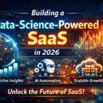
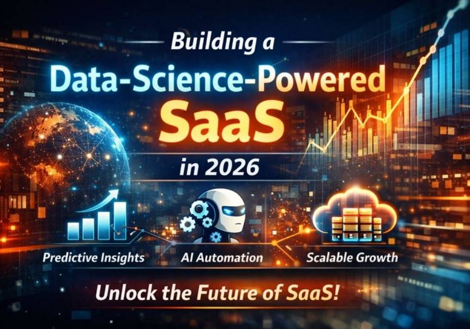
Build a Data-Science–Powered SaaS That Scales in 2026
Before building or investing time and money, one big question always comes up: “What exactly […]
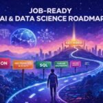
Gateway to AI Data Science & AI Automation
Before building or investing time and money, one big question always comes up: “What exactly…
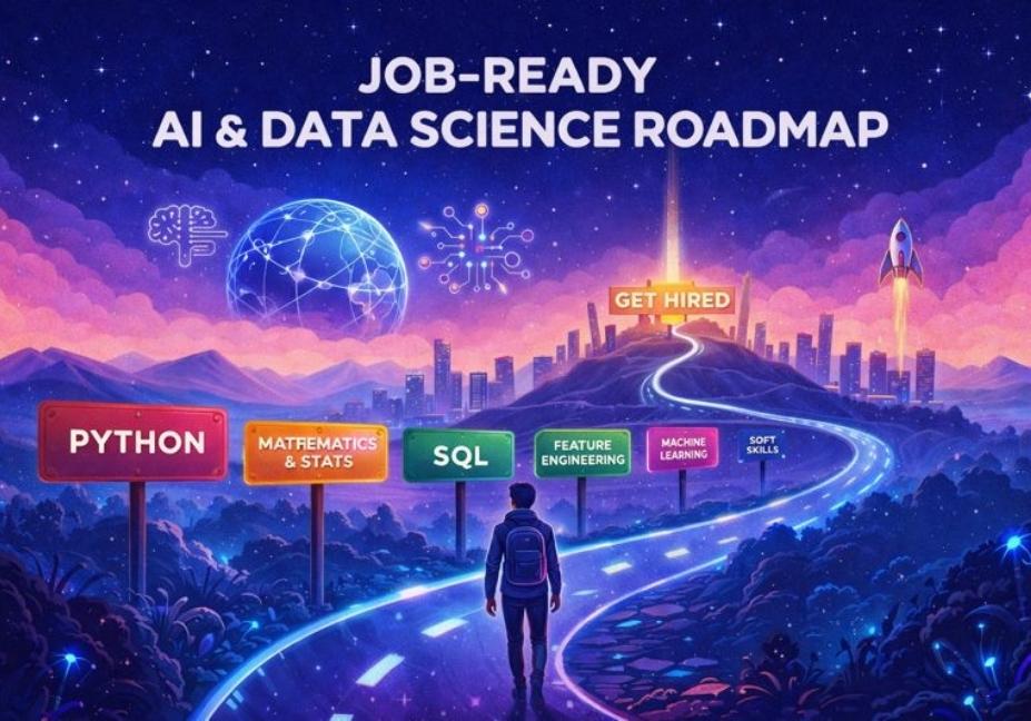
Breaking into AI and Data Science sounds exciting. But for most learners, it becomes confusing,…
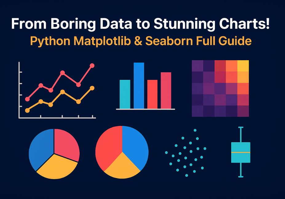
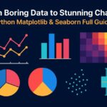
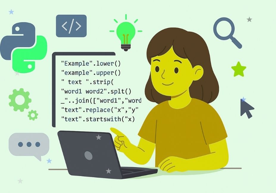
Have you ever looked at a long list of numbers and thought, “What does this…